Project overview
Field Marketing Organizations live and die by agent trust. Agility’s site was working against them — a fragmented collection of resources that made it nearly impossible for agents to find carrier training, track upcoming events, or manage licensing requirements. The result: increased support tickets and a slow onboarding process that was losing agents before they ever got started.
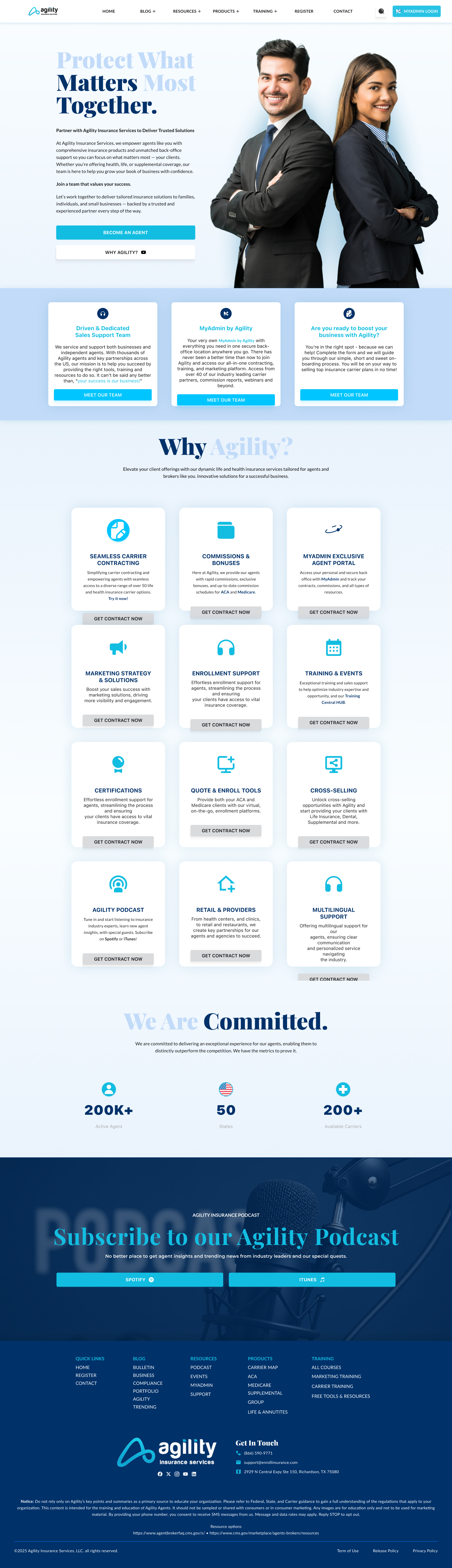
The original homepage had 11 navigation items and buried the contracting flow 4+ clicks deep. My role was to redesign AgilityFMO.com from the ground up — starting with research into how agents actually used the existing platform, stripping the information architecture down to three core pillars, and rebuilding the entire experience around agent success rather than organizational hierarchy.
The goal wasn’t just a new coat of paint. I rebuilt the underlying design system, restructured navigation, rewrote the content hierarchy, and introduced conversion-focused CTAs that guide agents from landing to contracting in as few steps as possible.
Establish a scalable design system
Architect a robust component library — from event calendars to podcast players — ensuring visual consistency across the entire site regardless of content type.
Streamline agent onboarding
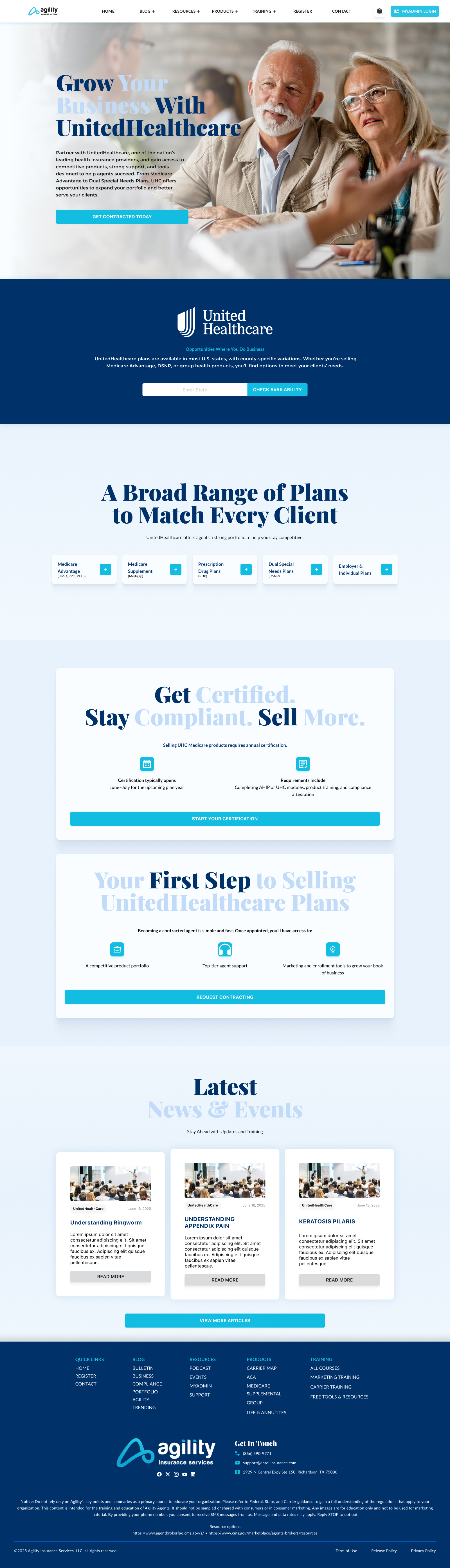
Create clear, high-conversion pathways for agents to join the FMO and access carrier contracts — reducing the number of clicks between landing and contracting.
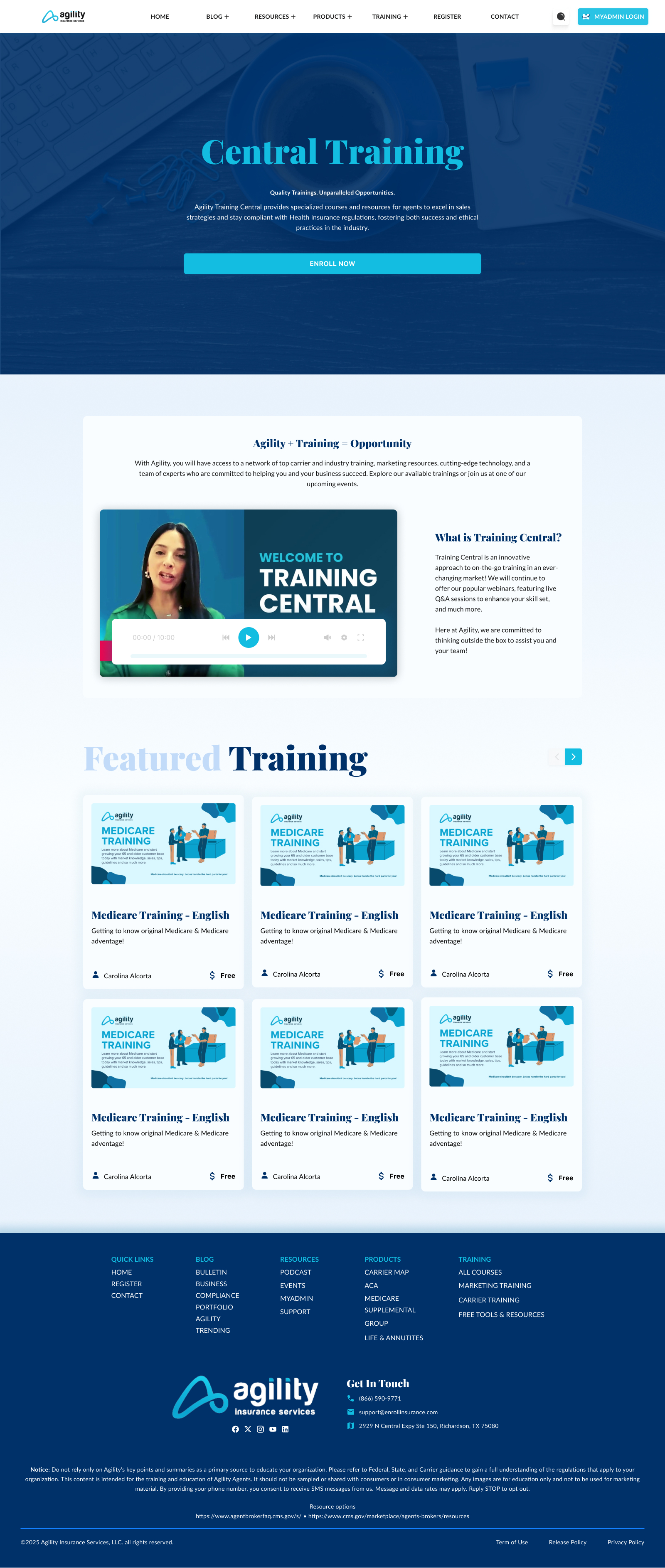
Centralize training & resources
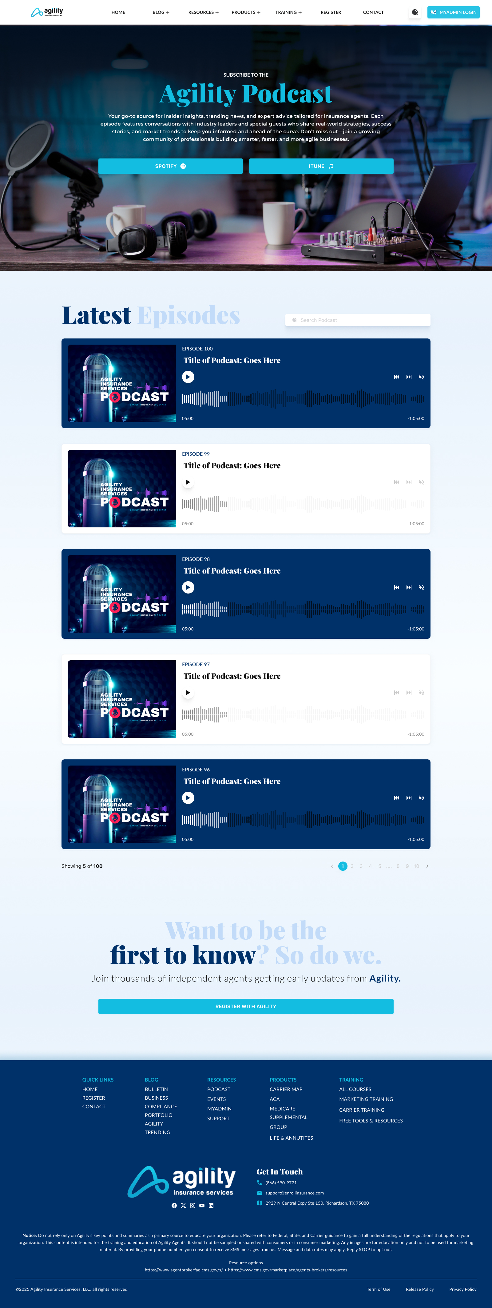
Build a modular Learning Center and Resource Hub that makes carrier videos, marketing tools, and licensing materials instantly accessible and searchable.
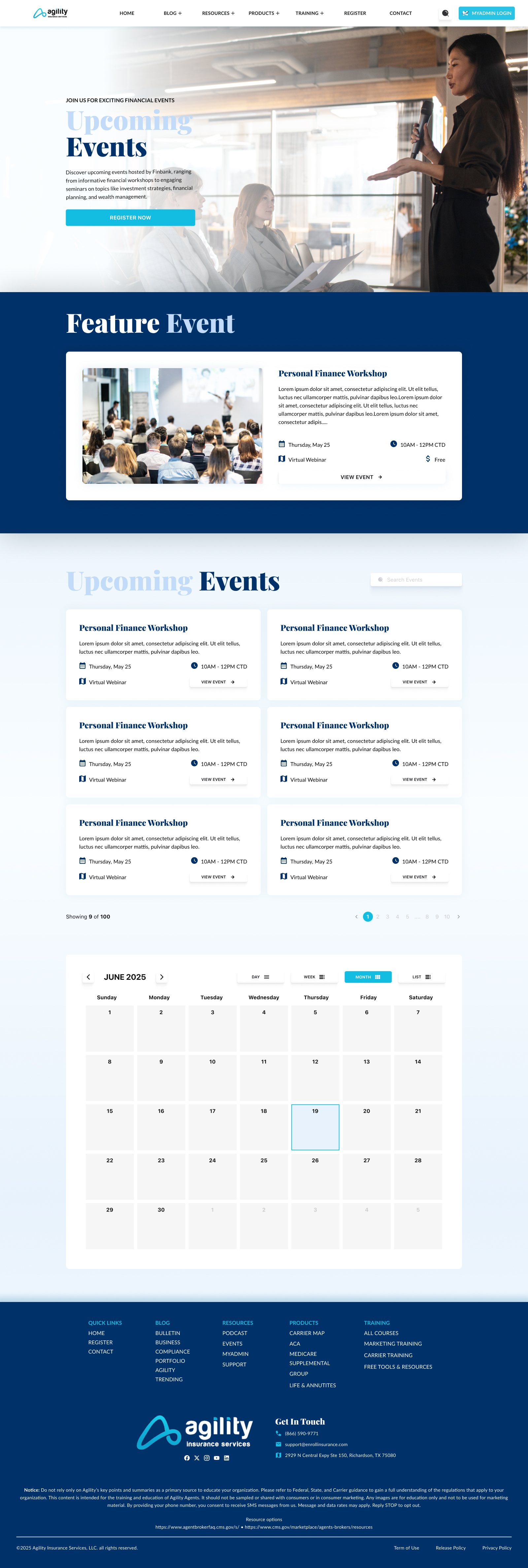
Dynamic event management
Design a functional, easy-to-navigate calendar system for webinars and local workshops — keeping agents connected to the community without leaving the platform.
Legacy audit & secondary research
I started by mapping how agents actually used the existing platform — where they got stuck, what they searched for most, and which pages generated the most support requests. The core finding: agents were overwhelmed by the number of clicks required to reach specific carrier information. The navigation had grown organically over time with no user-centered logic, and the homepage buried the most-needed actions below the fold.
MVP definition — 3 pillars
Rather than redesigning everything at once, I stripped the site down to three pillars that would deliver the most immediate agent value: Direct Resource Access (fast-tracking “My Profile” and “Contracting”), an Educational Hub (centralizing the Agility Podcast and Carrier Training Videos), and Community & Events (a real-time calendar and news feed). Everything else was deprioritized for a later phase.
Design system architecture
Before touching a single page layout, I built the component library. The system used a strict “Agility Blue” color palette and modular grid that could scale from a simple blog post to a full multimedia resource library without losing visual coherence. I designed consistent patterns for every media type agents would encounter — video cards, podcast players, downloadable PDF tiles, event calendar blocks — so nothing felt bolted on.
Stakeholder alignment & conversion focus
The main challenge throughout was preventing scope creep — stakeholders consistently wanted to add more content to the homepage. I used agent-centered research as my primary pushback tool, redirecting conversations toward measurable outcomes: fewer clicks to contract, clearer trust signals above the fold, and a homepage that functions as a conversion gateway rather than a content dump. Every CTA placement was deliberate and justified.
Zero scroll to the actions that matter
Join, Contract, and Training surfaced above the fold — the three things every agent needs first. Trust signals and social proof placed at the exact point of hesitation, not buried in the footer.
Community without leaving the platform
A filterable, real-time calendar for webinars and local workshops — browse by date or event type, register directly from the event card, stay connected to the FMO without a single redirect.
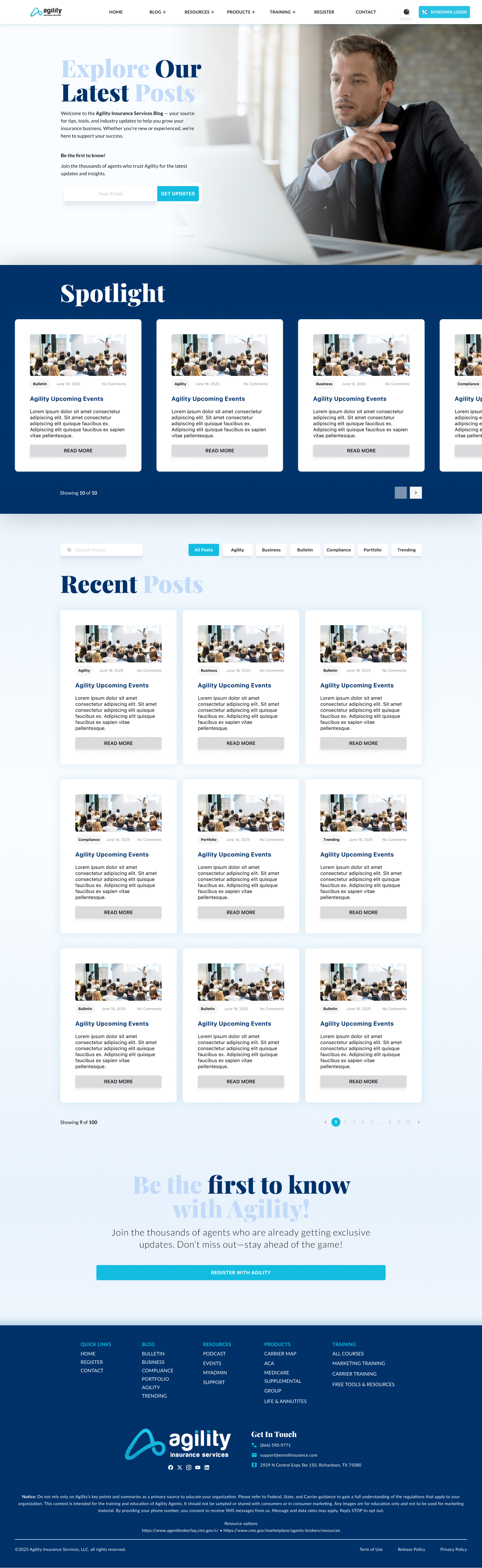
Educational hub & podcast player
A centralized Learning Center combining the Agility Podcast and Carrier Training Videos under one roof, with consistent card-based UI patterns regardless of media type.
Resource hub
A searchable, filterable library of marketing tools, carrier guides, and downloadable PDFs — organized by category so agents find what they need in seconds, not minutes.
No dead ends for new agents
A guided flow from first landing to completed contracting requirements — with progress indicators and inline help at every step. Agents always know where they are and what’s next.
Scalable design system
Every component built to extend. When stakeholders requested additional pages post-launch, the system absorbed them without breaking — maintaining brand integrity across 20+ unique page types.


Scalability is security
Building the design system before any page layouts meant that every stakeholder request for “one more page” could be absorbed without breaking the existing UX — a constraint that saved the project multiple times.
Designing for multimedia requires patterns
A video card, a podcast episode, and a downloadable PDF all carry different content but need the same visual weight. Building consistent media-type patterns early prevented the “bolted on” feeling that plagued the original site.
Stakeholder diplomacy is a design skill
Keeping the homepage focused on agent conversion rather than org announcements required consistent, research-backed pushback. The ability to say “no” with data is as important as any visual skill.
Trust through transparency
For an FMO, the website is the first handshake with a potential agent. Clean, modern design signals technical competence and professionalism — two things agents are betting their livelihood on when choosing a partner.